Gone are the days of colourless workplaces, rigid, and uniform. Yet, for office designers, there is more methodology behind bringing a splash of colour into a scheme than merely brightening up a space. As employers battle to attract and retain the best talent to drive business in competitive markets, colour can, both consciously and subconsciously, help make or break workplace design. Moreover, colour psychology can directly affect how workers perceive and operate within a space. Workers want to feel like their workplace is designed with their well-being and performance in mind.
What is colour psychology?
Colour psychology is the science behind how we perceive colours. Much research has been undertaken into how different colours can influence our emotions, evoke certain feelings or behaviours, and make us think in a certain way. These studies have found that working in environments peppered with certain colours can have a direct impact on our mental state and mood. It’s important that the colours used throughout the workplace are matched with the tasks and processes those environments are built for.
Harmonious hues
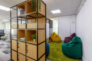
Whilst dark blues are excellent for meeting rooms, as they help evoke a sense of trustworthiness, bursts of vibrant colours can help foster innovation. Embellishing breakout areas and other collaborative spaces with these warm colours can help stimulate ideas and energy. However, it’s important to use these colours sparingly, as excessive usage has links to visual fatigue, which can foster distraction, rather than delivery.
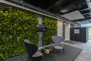
Greens, which help relax our eyes, are best used around screens and electronics. According to scientific studies, green is the easiest colour for our eyes to perceive. As seeing green causes less strain on the eyes, our nervous systems can relax. Consequently, it’s thought this can boost the morale and productivity of employees. Living walls help go one step further by adding a greater degree of naturality – and improved air conditions – to a scheme.
Finetuned tones
The most successful workplaces will harmonise the colours used with what those spaces are designed to achieve. Red, commonly thought to be a colour to induce anger, is associated with energy, excitement, and activity. It can be a powerful colour when subtly blended into spaces where productivity levels need to be high. On the other end of the scale, cool colours, like blue and purple, meanwhile have the opposite effect and are related to tranquillity and focus.
Interestingly, fractal patterns, used in wallpapers, artwork, and architecture, have been linked with stress reduction. The patterns have been proven to relax the brain, making it especially ideal for therapeutic environments like break areas. For windowless rooms too, the impact that fractal patterns have on the brain can counteract the negative side effects of reduced sunlight. Our experience has found that, in basement schemes especially, these designs help get the most out of a space in terms of employee performance. Adopting the right colours, and the amount of them used, in the right spaces can help foster a happier, more focused, and creative workforce. Understanding the positive impacts that colour psychology has on our minds is the first step in setting the right tone for a successful business.